Building Brands & Guidelines
You can call them Visual Brand Languages, Brand Guidelines, Style Guides or Design Systems but it all comes down to crafting tools for conveying a consistent message to the world, regardless of medium.
Thoughtfully crafted standards and systems will save teams time, money and frustration. Unfortunately even the best ones are not magic. You can’t shove ideas and requests through a set of fixed palettes and templates and expect an optimized and on-brand solution that connects with users… they just don’t work that way.
It’s important to treat these systems as living and flexible guides. Too rigid and you quickly limit development teams and create obstacles in the future as new applications are warranted. They should be able to grow and evolve with the needs of development teams and the expectations of the market/end-user.
Comprehensive Brand Development; Systems, Standards & Guidelines
In Good Company was a longitudinal study in optimizing customer engagement through values-driven financial wellness using a living prototype to test and evolve our hypothesis.
With this iterative test & learn approach and being public-facing, it was important that we took precautions to protect the MassMutual brand and limit the potential liability stemming from a constantly changing offering. We built a “sandbox” brand that aligned with, and reinforced, MassMutual’s brand, but one that allowed us to move quickly and with additional levels of autonomy.
This branding effort was comprehensive and covered digital, print, experiential, learning techniques, financial advisor behavior, etc.
Strategic Brand Positioning
The brand had two major requirements, in juxtaposition - create separation from our parent brand, in order to allow us to work freely and iterate often in order to protect the MassMutual brand -and- Create a brand that, if successful, is an appropriate introduction or “ladder-brand” to MassMutual.
Our solution was informed by the MassMutual Brand System and echoes MassMutual’s brand positioning but was reconfigured to introduce a unique and personal approach.
Transferable/”Own-able” Brand
The majority of MassMutual’s 8,500+ advisors do not conduct business under the MassMutual brand but rather as independent brands supported (back-of-the-house) by a Fortune 100 organization. These advisors and agencies operate as DBAs (Doing Business As) and are locally branded based on the values and missions they self select. This can present some friction as these firms commonly do not partake in MassMutual branded efforts and campaigns.
We intentionally built the IGC brand to be transferable or “own-able” so that all MassMutual advisors could participate in the program regardless of how closely they align their practice or agency with the MassMutual brand.
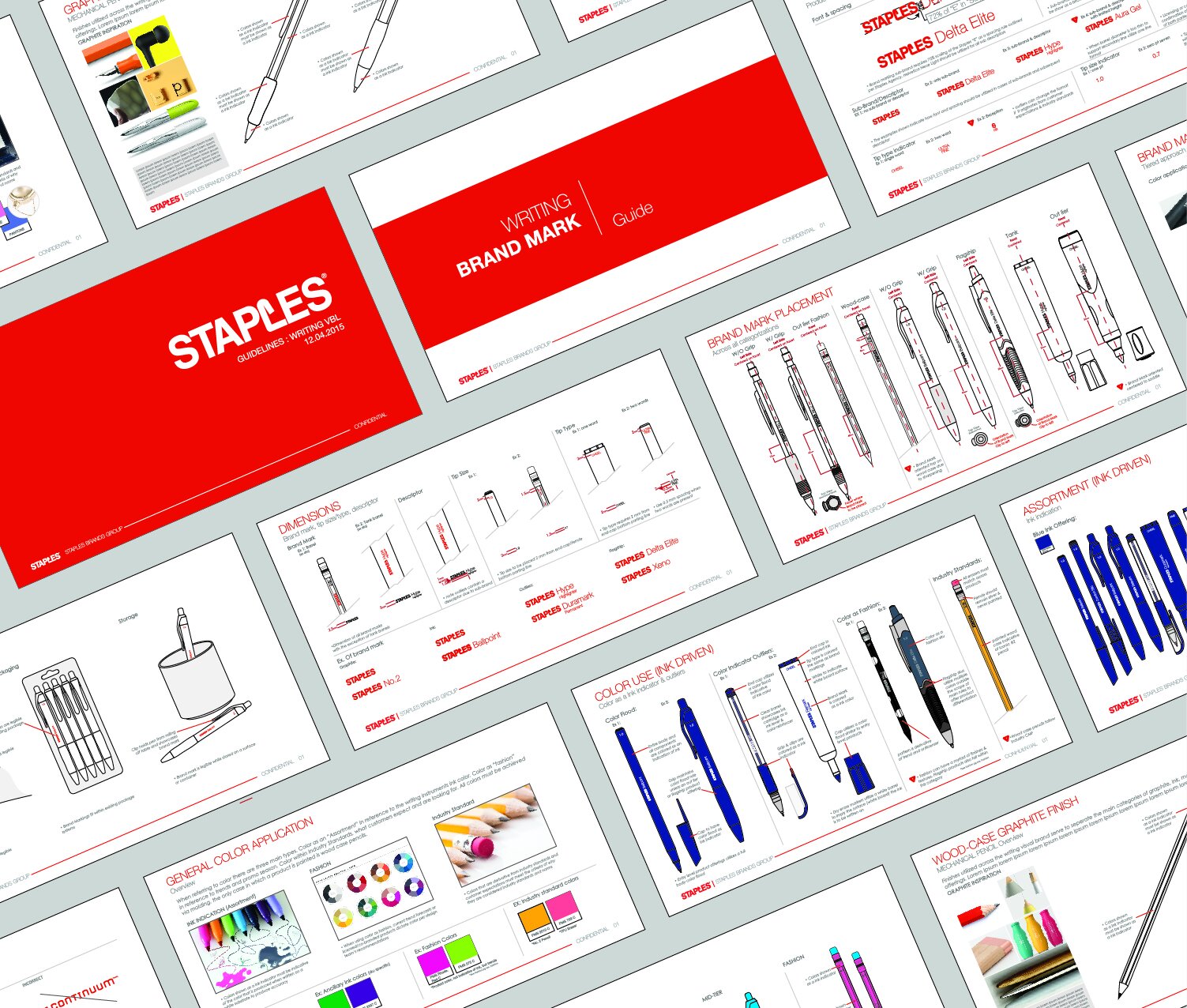
Product Line Standardization; Systems & Guidelines
Prior to my arrival, Staples Brand Group had a mixed-bag of offerings within product lines, a combination of home-grown and off-the-shelf solutions. This was due to the fact that Merchant/Buyers were making subjective decisions regarding design direction. This approach was only magnified by the fact that this happens multiple times a year, year after year- so the already fragmented collections were compounded by out-dated designs.
I used this exercise to introduce the benefits and how to approach product line languages as well as the positive impact this methodology can have on supply chain, manufacturing and the bottom line. We moved the mindset from “subjective design” to “objective design” where decisions were backed by a larger strategic vision. This vision took into account impact on shelf, in catalog and in-use scenarios.
Our approach of merchandise-driven design languages was quickly implemented in product lines across the organization and resulted in entire product lines undergoing VBL exercises.
Naming & Product Descriptor Methodologies
Without a clear or consistent approach to product naming or product/attribute descriptors Staples’ offerings could leave the customer scratching their head.
These inconsistencies resulted in the erosion of perceived brand value, looked as though they were simply buying other companies products, and caused confusion both internally and at retail.
We worked with the designers, product manager, merchant/buyers and manufacturing vendors to establish consistent naming and attribute communication methodologies. These efforts helped strengthen product positioning individually, as a collection, and created greater consistency and clarity for the consumer at retail.
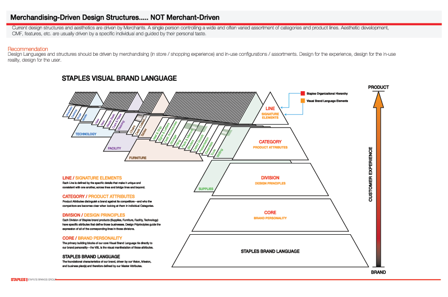
Merchandise-Driven Line Language Structures
There was a little “forrest through the trees” thing happening across the majority of product categories. Individual decisions were being made in what felt like a vacuum, as consideration was not given to the other Staples products that may live in the same space after purchase and how, if at all, they were connected.
We worked with Merchants, Buyers and Product Managers to introduce a merchandise-driven approach to design and product development. We proposed design languages and structures should be driven by the merchandising (in store/shopping experience) as well as the in-use scenarios / configurations. Design for the experience, design for the in-use reality, design for the user.
I work with companies of all sizes with branding. Some might be starting out and looking for help with brand identity, others may be looking to introduce a physical visual brand language as a competitive edge. Whether its logo development or a full-blown brand language I enjoy helping organizations reimagine and explore how they would like to be perceived in market. Along the way I look for ways to help set them apart from their competitors, assure their “designs” align with their values, and always put their best foot forward.
Comprehensive Physical Brand Language; Systems, Standards & Guidelines
Working across all of Kensington’s 6 product categories to build comprehensive physical brand standards and strategy. Our approach leveraged Design-for-Manufacturing best practices which eliminated the majority of secondary and post-production finishes, reducing piece cost and unnecessary waste.
Covering: Physical product, print & digital assets, interface, materials selection and strategy.
Consisting of; Brand Guide (physical & digital), Materials and Samples Library, physical finish and color reference swatches ( and equivalents)
Product Category Visual Brand Language; Guidelines, Systems & Standards
I worked with Kensington’s Security product category to establish a Visual Brand Language, documentation and tools to assure adherence. This helped Kensington stand-out as the industry leader and establish strategic intellectual property (trademarks, trade dress, patents).
Covering; Physical product, print & digital assets, interface, materials selection, product positioning and strategy.
Consisting of; Brand Guide (physical & digital), Materials and Samples library, Physical finish and color reference & equivalents swatches


